Full Time
Dosh + Cardlytics
Across Dosh and Cardlytics, I helped evolve the Dosh app from a largely passive cashback experience into a more active, discoverable rewards product. I led design for activatable offers, feed and search improvements, streak-based rewards, and campaign experiences—then helped adapt relevant patterns for partner rewards platforms serving Chase, Bank of America, and Venmo.
Year :
2017-2024
Industry :
Fintech
Business :
Cardlytics
Duration :
5 Years
TURNING PASSIVE CASHBACK INTO ACTIVE ENGAGEMENT
Dosh’s original card-linked model was intentionally frictionless: users could earn cash back without repeatedly opening the app. That simplicity was central to the product’s appeal, but it also gave users little reason to return, explore new merchants, or actively engage with available offers.
I led the design work for introducing activatable offers, which required users to intentionally activate selected rewards before making a purchase. The challenge was adding a new interaction without making the experience feel confusing or unnecessarily burdensome.
I designed how activation status, eligible offers, calls to action, and supporting information appeared across the feed and offer experience. The resulting model gave users a clearer role in earning rewards while creating more opportunities for Dosh and its merchant partners to build meaningful engagement.

CHANGING DIRECTION WHEN CLEANER WASN’T BETTER
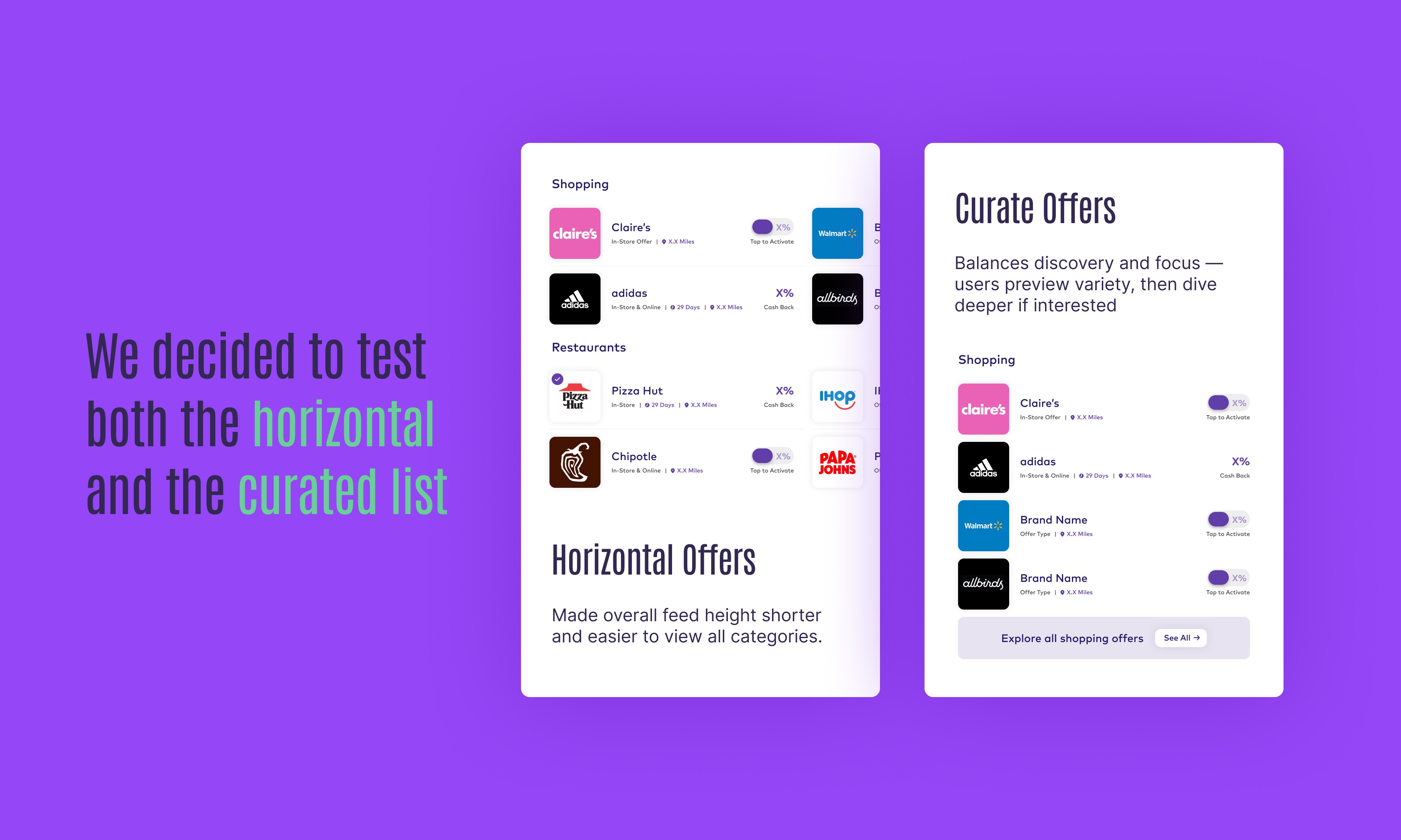
Users were not fully exploring Dosh’s long vertical offer feed, so we tested organizing merchant categories into horizontal rows. The layout appeared cleaner and reduced the perceived length of the page, but it created a different problem: users rarely scrolled sideways, leaving many offers effectively hidden.
Based on that behavior, I changed direction and designed a two-column grid that previewed a limited number of offers within each category, paired with a clear path to view more. The solution preserved visual structure while using a more familiar browsing pattern that made additional offers easier to discover.
I also helped make search more useful and predictive by introducing merchant suggestions, recent searches, and relevant offers as users typed. Together, the feed and search improvements shifted discovery from passive scrolling toward a more intentional and responsive experience.
CREATING MORE REASONS TO RETURN
Beyond the larger offer-discovery work, I led the creative direction for several focused features intended to improve motivation, relevance, and repeat engagement.
Streak-based rewards turned routine shopping activity into visible progress, giving users an additional reason to return and continue participating. For selected merchant campaigns, I designed lightweight, one-time promotional experiences that highlighted timely offers without permanently adding more complexity to the main interface.
These features were smaller than the core feed redesign, but each addressed a specific behavioral need: helping users find relevant value, understand their progress, and notice important opportunities at the right moment.

EXTENDING THE EXPERIENCE INTO PARTNER PRODUCTS
After Dosh became part of Cardlytics, my primary focus remained the Dosh app and the continued evolution of its core product experience. I also contributed to rewards SDKs and white-label experiences for major partners including Chase, Bank of America, and Venmo.
The central challenge was determining which parts of the rewards experience needed to remain consistent and which could adapt to each partner’s brand, audience, and technical environment. I created partner-ready interface patterns, mockups, and implementation guidance while collaborating with product, engineering, and partner stakeholders.
Successful ideas developed within Dosh could also inform the broader partner platform when they were appropriate for those environments. This allowed the consumer app to serve as both a product in its own right and a place to develop and refine rewards experiences that could scale into larger financial ecosystems.

Full Time
Dosh + Cardlytics
Across Dosh and Cardlytics, I helped evolve the Dosh app from a largely passive cashback experience into a more active, discoverable rewards product. I led design for activatable offers, feed and search improvements, streak-based rewards, and campaign experiences—then helped adapt relevant patterns for partner rewards platforms serving Chase, Bank of America, and Venmo.
Year :
2017-2024
Industry :
Fintech
Business :
Cardlytics
Duration :
5 Years
TURNING PASSIVE CASHBACK INTO ACTIVE ENGAGEMENT
Dosh’s original card-linked model was intentionally frictionless: users could earn cash back without repeatedly opening the app. That simplicity was central to the product’s appeal, but it also gave users little reason to return, explore new merchants, or actively engage with available offers.
I led the design work for introducing activatable offers, which required users to intentionally activate selected rewards before making a purchase. The challenge was adding a new interaction without making the experience feel confusing or unnecessarily burdensome.
I designed how activation status, eligible offers, calls to action, and supporting information appeared across the feed and offer experience. The resulting model gave users a clearer role in earning rewards while creating more opportunities for Dosh and its merchant partners to build meaningful engagement.
CHANGING DIRECTION WHEN CLEANER WASN’T BETTER
Users were not fully exploring Dosh’s long vertical offer feed, so we tested organizing merchant categories into horizontal rows. The layout appeared cleaner and reduced the perceived length of the page, but it created a different problem: users rarely scrolled sideways, leaving many offers effectively hidden.
Based on that behavior, I changed direction and designed a two-column grid that previewed a limited number of offers within each category, paired with a clear path to view more. The solution preserved visual structure while using a more familiar browsing pattern that made additional offers easier to discover.
I also helped make search more useful and predictive by introducing merchant suggestions, recent searches, and relevant offers as users typed. Together, the feed and search improvements shifted discovery from passive scrolling toward a more intentional and responsive experience.
CREATING MORE REASONS TO RETURN
Beyond the larger offer-discovery work, I led the creative direction for several focused features intended to improve motivation, relevance, and repeat engagement.
Streak-based rewards turned routine shopping activity into visible progress, giving users an additional reason to return and continue participating. For selected merchant campaigns, I designed lightweight, one-time promotional experiences that highlighted timely offers without permanently adding more complexity to the main interface.
These features were smaller than the core feed redesign, but each addressed a specific behavioral need: helping users find relevant value, understand their progress, and notice important opportunities at the right moment.
EXTENDING THE EXPERIENCE INTO PARTNER PRODUCTS
After Dosh became part of Cardlytics, my primary focus remained the Dosh app and the continued evolution of its core product experience. I also contributed to rewards SDKs and white-label experiences for major partners including Chase, Bank of America, and Venmo.
The central challenge was determining which parts of the rewards experience needed to remain consistent and which could adapt to each partner’s brand, audience, and technical environment. I created partner-ready interface patterns, mockups, and implementation guidance while collaborating with product, engineering, and partner stakeholders.
Successful ideas developed within Dosh could also inform the broader partner platform when they were appropriate for those environments. This allowed the consumer app to serve as both a product in its own right and a place to develop and refine rewards experiences that could scale into larger financial ecosystems.
Full Time
Dosh + Cardlytics
Across Dosh and Cardlytics, I helped evolve the Dosh app from a largely passive cashback experience into a more active, discoverable rewards product. I led design for activatable offers, feed and search improvements, streak-based rewards, and campaign experiences—then helped adapt relevant patterns for partner rewards platforms serving Chase, Bank of America, and Venmo.
Year :
2017-2024
Industry :
Fintech
Business :
Cardlytics
Duration :
5 Years
TURNING PASSIVE CASHBACK INTO ACTIVE ENGAGEMENT
Dosh’s original card-linked model was intentionally frictionless: users could earn cash back without repeatedly opening the app. That simplicity was central to the product’s appeal, but it also gave users little reason to return, explore new merchants, or actively engage with available offers.
I led the design work for introducing activatable offers, which required users to intentionally activate selected rewards before making a purchase. The challenge was adding a new interaction without making the experience feel confusing or unnecessarily burdensome.
I designed how activation status, eligible offers, calls to action, and supporting information appeared across the feed and offer experience. The resulting model gave users a clearer role in earning rewards while creating more opportunities for Dosh and its merchant partners to build meaningful engagement.
CHANGING DIRECTION WHEN CLEANER WASN’T BETTER
Users were not fully exploring Dosh’s long vertical offer feed, so we tested organizing merchant categories into horizontal rows. The layout appeared cleaner and reduced the perceived length of the page, but it created a different problem: users rarely scrolled sideways, leaving many offers effectively hidden.
Based on that behavior, I changed direction and designed a two-column grid that previewed a limited number of offers within each category, paired with a clear path to view more. The solution preserved visual structure while using a more familiar browsing pattern that made additional offers easier to discover.
I also helped make search more useful and predictive by introducing merchant suggestions, recent searches, and relevant offers as users typed. Together, the feed and search improvements shifted discovery from passive scrolling toward a more intentional and responsive experience.
CREATING MORE REASONS TO RETURN
Beyond the larger offer-discovery work, I led the creative direction for several focused features intended to improve motivation, relevance, and repeat engagement.
Streak-based rewards turned routine shopping activity into visible progress, giving users an additional reason to return and continue participating. For selected merchant campaigns, I designed lightweight, one-time promotional experiences that highlighted timely offers without permanently adding more complexity to the main interface.
These features were smaller than the core feed redesign, but each addressed a specific behavioral need: helping users find relevant value, understand their progress, and notice important opportunities at the right moment.
EXTENDING THE EXPERIENCE INTO PARTNER PRODUCTS
After Dosh became part of Cardlytics, my primary focus remained the Dosh app and the continued evolution of its core product experience. I also contributed to rewards SDKs and white-label experiences for major partners including Chase, Bank of America, and Venmo.
The central challenge was determining which parts of the rewards experience needed to remain consistent and which could adapt to each partner’s brand, audience, and technical environment. I created partner-ready interface patterns, mockups, and implementation guidance while collaborating with product, engineering, and partner stakeholders.
Successful ideas developed within Dosh could also inform the broader partner platform when they were appropriate for those environments. This allowed the consumer app to serve as both a product in its own right and a place to develop and refine rewards experiences that could scale into larger financial ecosystems.