Dosh + Cardlytics
I helped evolve Dosh’s cashback app with offer activation, discovery, and search, then adapted relevant patterns for partner rewards experiences at Chase, Venmo, and Bank of America.
Sr. Designer → Lead Product Designer
2017–2024
Professional work


Dosh: making cashback easier to discover and act on.
Helping people find rewards worth coming back for.
A frictionless cashback product gave people little reason to return and explore. New interactions needed to make rewards easier to discover without undermining the simplicity people valued.
Make activation understandable.
I led design work for activatable offers, defining how eligible rewards, activation status, calls to action, and supporting information appeared across the experience.


Change direction when cleaner isn't better.
Horizontal category rows looked cleaner, but users rarely scrolled sideways. I changed direction to a two-column preview grid with a clear route to more offers.


Let search do some of the work.
Merchant suggestions, recent searches, and relevant offers helped make discovery more intentional. Behavioral signals and qualitative feedback informed the iterations.

Give people a reason to return.
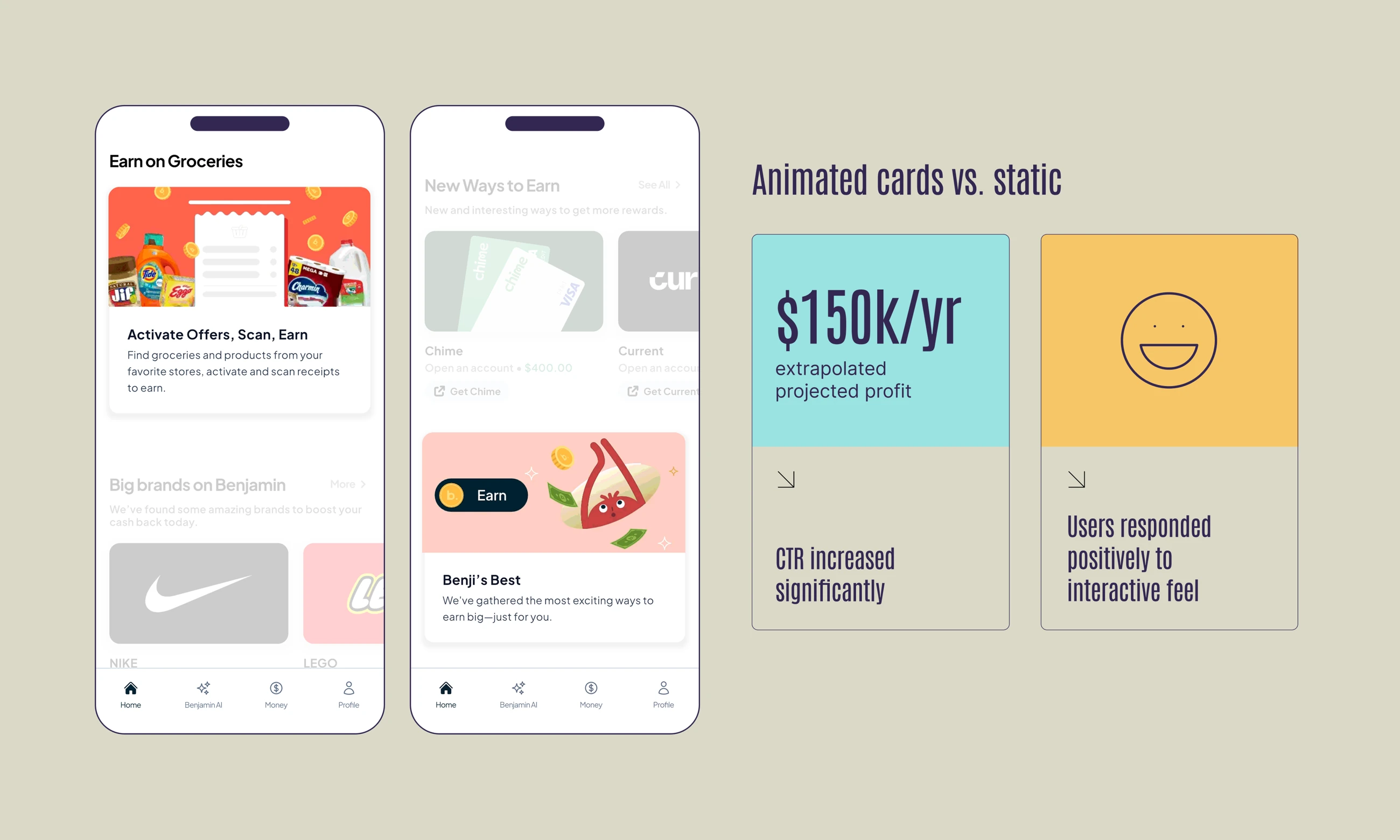
I led creative direction for streak-based rewards and focused merchant campaigns. Visible progress made repeat shopping activity easier to understand, while temporary campaign experiences highlighted timely offers without permanently adding complexity to the feed.


From Dosh experiments to partner rewards.
Dosh’s SDK powered rewards experiences for Chase, Venmo, and Bank of America. We often tested engagement mechanics in the Dosh app, then brought those findings into partner programs where they fit the audience and product. My contributions included partner-ready interface patterns, mockups, and implementation guidance, adapting the experience to each partner’s brand and constraints.


Carry the learning into the details.
The partner work went beyond the offer feed. Entry points, activation states, offer details, and expiration messages needed to feel coherent within each host product. These examples show how shared rewards patterns took different shapes across the partner experiences.


Carry the brand beyond the app.
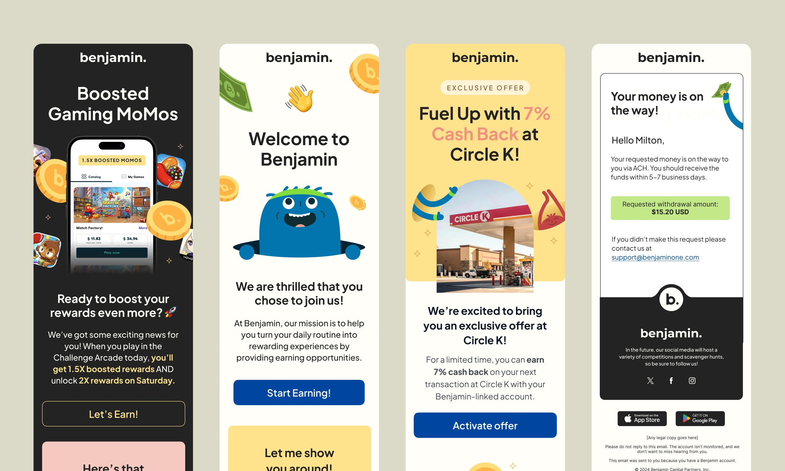
Selected campaign assets show the visual range of the Dosh experience, from merchant promotions to seasonal creative and email.


What came out of it.
The work connected Dosh’s consumer product with partner rewards experiences for Chase, Venmo, and Bank of America. Testing engagement mechanics in Dosh gave us a way to learn before adapting relevant patterns for partner programs. My role combined product design, prototyping, implementation guidance, and collaboration with product, engineering, analytics, and partner stakeholders.